Behind the scenes at SparkFun, we’ve been working hard on making our website easier to use (and nicer to look at). This evening we’ll be launching the first round of improvements. Over the years you've seen more and more content added to the SparkFun site, and it was time to take a step back and better organize and categorize everything to make navigating the site a little more intuitive for everyone using it. Below is a quick overview of what you’ll be seeing; we're very excited about the updates!
Top Level Navigation
The first thing you may notice is a change in our top-level navigation. We’re replacing the current options to reflect what we've observed are the most heavily used sections of the site:
- Shop: Our catalog of more than 2,000 quality products
- Learn: Free resources for a wide range of electronics-focused topics, including 500+ tutorials and nearly 1,000 videos
- Blog: Our way to share and discuss the projects, insights and news (and Photoshop contests) we're into on a daily basis
- Support: As always, we're actively committed to solving any issues and helping customers troubleshoot
New Product Menu Tray
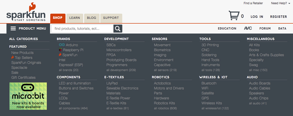
The next thing you’ll notice is the change in our product menu. We’ve replaced the left-side navigation with a mega-dropdown that will allow viewers to see more options at once. With a simple roll-over or click, you’ll have a snapshot view of a large portion of our catalog. Perhaps more importantly than the drop-down product menu itself is the recategorization we’ve done across our entire product line. The top-level categories are now Brands, Components, Development, E-Textiles, Sensors, Robotics, Tools, Wireless & IoT, Miscellaneous and Audio. From the top levels you’ll be able to narrow down your search to find what you need.
Faceted Search
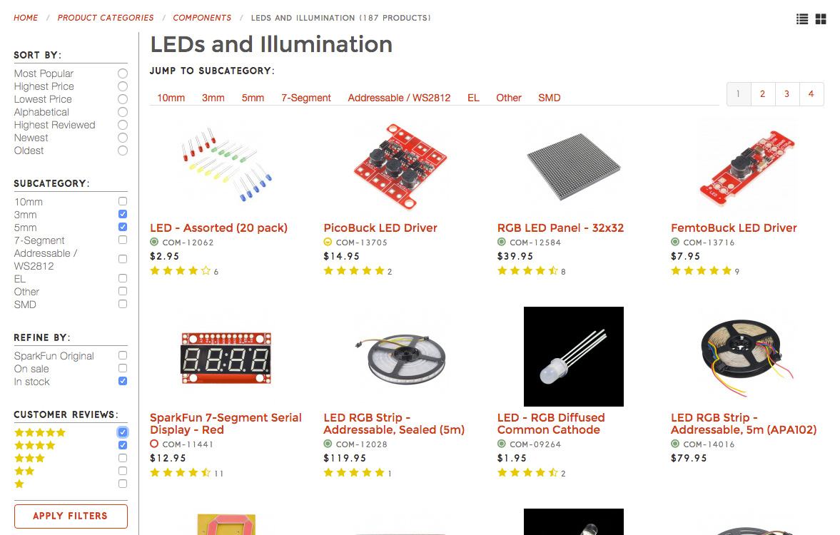
Once you land on any level of a category page, you’ll have options to narrow down your search. We’ve included direct links to any available subcategories at the top of the page, as well as the ability to apply filters (seen on the bottom left). Future plans include adding more filtering options like color, size, power capacity, etc.
Where did all the other links go?!
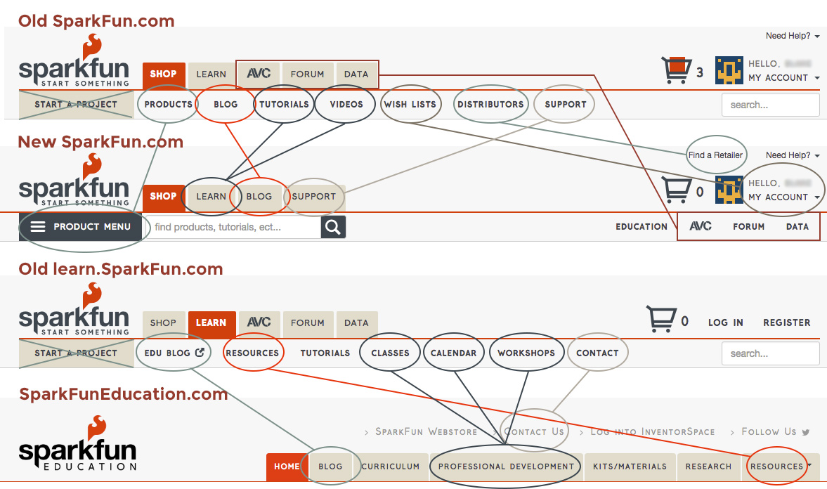
In order to reduce clutter, we’ve essentially removed a layer of navigation and combined some resources. Most of the links on the “Learn” tab were heavily education-focused and have moved to our SparkFun Education website. This graphic should help you find what you need while we all get the lay of the land.
We hope you enjoy the new layout and features of the site as much as we do; let us know what you think!




A (minor) redesign that doesn't include 50-75% more white space? Ah now you'll never be trendy if you don't blindly follow web design trends!
I'm giddy to find a reason to buy something so I can use the filters! They can be so helpful when done right :)
I love the changes. Thanks for keeping it fresh. I like the simplification of the menu structure and new improved filters. Keep up the Great Work Sparkfun!
Drop down mega menu: Really hard to read the thin gray font on dark gray background.
Honestly, I really liked the old design and found it easy to navigate. But I did some browsing the other day for a new project I'm thinking about, and I found the new site to also be easy to navigate. So coming from someone who generally hates it when people change things on me, good job!
Found a potential bug. New nav > robotics > actobotics --- no results found I'm using a Win 10 Mobile, Phone 950XL on latest updates, with the default IE browser. I can provide screen shots to an email upon request.
Thank you Mitch, we are currently working through a large recategorization QA process. It's going to take some time to match our entire catalog with some of the new categories we've created. We hope to have it all resolved today.
Could you please put the current date and time at the top of the page? Thanks
What about the AVC tab? Where will that be? Opps never mind I see it now under the education part.